
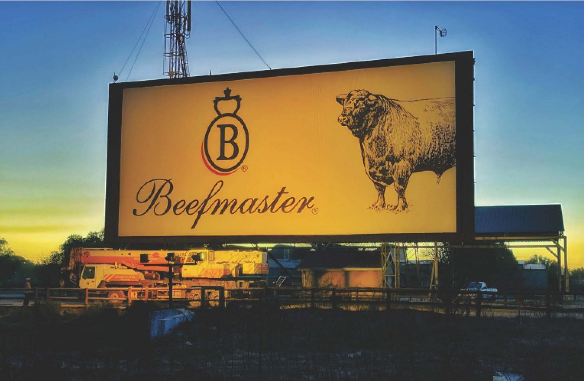
October 2021: If you drive on the N12 between Warrenton and Christiana, you will be familiar with the red, white, and black Beefmaster Feedlot sign along the side of the road, which has a stately and proud presence next to highway.
According to the founder of the Beefmaster Group, Lourie van Reenen, the sign has become somewhat of an icon, which has, throughout the years, piqued the interest of locals and visitors alike.
“When we erected the sign in the 1980s it got the tongues wagging. It was a very unique thing in the area – the only one like it,” says Lourie. “It generated so much interest due to its size, which, if you had to lay it out on the floor, is about as big as a netball court.”
For many locals who have long been wondering what the origin of the sign is, here is the story.
“We wanted to easily direct people to our Feedlot, and a sign was the obvious choice, but it was too expensive to have it custom made,” says Lourie. “On top of this, there was a regulation at the time that made it illegal for anyone to erect a sign next to a national highway or main road, unless it was attached to a building.”
Lourie learnt of a screen that was for sale in Roodepoort and knew he found his answer. It was previously used by a drive-in theatre, which became old fashioned and unpopular in the 1980s due to the advent of TV, so the owner decided to sell it.
“The sign actually cost me nothing because I bought it for R600 and then rented it out for R600 as ad space in Johannesburg over a period of 12 months, before having it broken down in parts and brought to Christiana via a flatbed truck,” says Lourie.
The sign was arranged on the floor in the Beefmaster workshop, sprayed an off-white colour, and a local artist, Mr Bonti from Bontisigns, was called from Bloemfontein to carefully draft the lettering as well as the logo by hand while it was on the floor – first using a pencil, and then it was filled in with the trademark colours of the Beefmaster Group – black and red. Thereafter it was assembled.
“We overcame the regulation hurdle by putting the sign up next to a building on our property – luckily it was still in a great position on the N12 to attract maximum attention.”
Van Reenen says that people were indeed very interested in it, asking all sorts of questions, and being surprised by the effort put into making the sign a reality.
“The welding was extremely beautiful and crafted to perfection,” says van Reenen. “We added three floodlights over the sign to brighten it up, and at night it really is an admirable sight!”
Today many of the nostalgic signs that are remembered with fondness from the 1980s are either derelict, don’t exist anymore due to poor maintenance, or simply replaced for newer, smarter ones. But this is not the case with Beefmaster Feedlot sign.
“The sign is a landmark that we thought is important to preserve. At the same time, we wanted to bring it more in line with our updated corporate identity and branding. This resulted in us opting to update the existing sign with a more modern look and feel,” explains Roelie van Reenen, supply chain director at Beefmaster Group, and son of Lourie.
The sign’s facelift includes a more prominent logo, as well as an image of a bull. The welded steel frame has been changed into a black border.
“Hand-painted signage and typography on billboards this big isn’t really done anymore, so we had to have the new signage printed on canvas, which was stretched to fit,” explains Roelie.
Although Lourie is no longer involved with the day-to-day running of the business, he is still consulted for an “experienced opinion” by Roelie as well as Louw – CEO of the Beefmaster Group.
So, does Lourie approve of the new and updated look?
“I like it very much. It looks neat and reflects positively on the Beefmaster image. I am sure it will continue to create talkability in the area for generations to come,” concludes Lourie.


